TCM B2B Website
As part of a website refresh, I worked with marketing managers at Teacher Created Materials to audit, research, and design improvements to the existing UX/UI of the B2B website. What started as an effort to extended visual design systems through updated banner images turned into an overall collaborative effort to improve the user experience. At the same time, customers and B2B sales reps navigate the website.
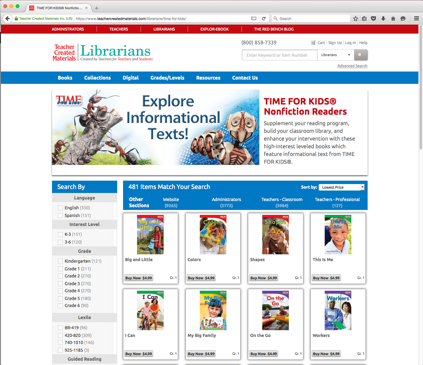
The Homepage: Before
This site had many useful resources but a busy homepage with outdated imagery for the time. There were many opportunities to clean up the structure and give a more precise navigation direction, giving the listed product more visible real estate.
Homepage: After
Below is the result of the redesign of the homepage. Elements of the site fill the width of the screen. With this site, we wanted to inspire and tug at librarians' heartstrings with new, whimsical imagery. While improving the function, we made adjustments visually to give a sense of wonder and encourage browsing.
Header Menu
Before, we had a fixed navigation menu, with no hover-state. We added some dimension to this menu style but also spread it out to adjust evenly along with the screen. Some navigation tabs were re-evaluated with my managers when I saw opportunities to consolidate them. I saw a chance to make this website a tool for sales reps and consumers and created a new "My List" feature.
Navigation
Before, the books highlighted were being overpowered by borders and shadows and crowded by stats on the title. Considering these being highlight books, I first decided to condense the carousel by creating an option to toggle between 'New Releases' and 'Best Sellers.' Managers agreed that this freed up valuable space to add promotions below, without them disappearing. Previously, if you hovered over a book, a 'quick view' would show up, which added some clutter to the browsing experience, sometimes covering valuable information and links. The covers take up more visual space with a simple 'View Book' button for a quick view to appear. Once additional promotions appear below, we added quick links to popular subject areas so that the user could continue browsing without having to go back to the top.
Banners: Before
One of our first focuses was to get the overall visual style unified. At the time, when this site was first getting built, banners were created as needed. Once reviewed, I noticed that there were some inconsistencies. Sometimes they showed books, and sometimes they didn't. If they had headers, they often varied in typefaces and effects. While many of these had valuable info in the text, some of it became too cumbersome for the banner to cover. After reviewing with the marketing manager, we cut this text down significantly, as a lot of these features are mentioned again on product page descriptions. Overall, these banners needed something that unified them in style, while the subjects highlighted still had so much variety.
Banners: After
After looking over the previous designs, I went back to the objective to inspire wonder and engagement. When you think of a classic library, you can sense the feel and smell of paper. As library technology becomes more accessible, it broadens resources for those who frequent a library. With that in mind, I decided to anchor all of these diverse subjects together by incorporating an organic paper texture over each banner, blending it with some sharp, modern touches of bold futuristic buttons and dimensions. Characters burst out of frame as subjects come to life to introduce their specific product pages.


Results Page
Before and After
Before and After
The previous layout felt over categorized in all of these boxes. It was a pretty simple choice to take away the borders and shadows. That alone let each product breathe a little more. I also redesigned the results cells to give the covers more front and center hierarchy. We made room for a quick-add "My List" feature, mentioned later, to quickly save books to an active list. Before, there was a bit too much space between each data item associated with each book. With everything being relatively the same size, I adjusted the appearance of the title, price, grade, and Quickview buttons for a more balanced visual hierarchy.

Product Page
Before and After
Before and After
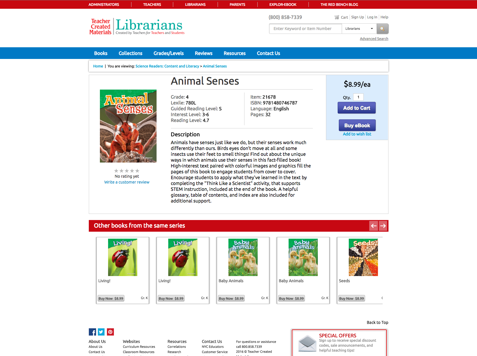
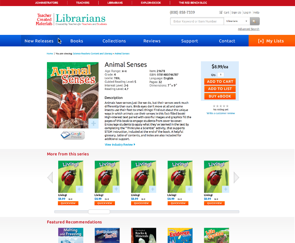
Again, we increased the size of the product images. I also encouraged us to incorporate Google Previews rather than the rating system. The Google Preview is a more valuable asset for Librarians reviewing books. While not all books have ratings assigned to them, adding the Google Preview makes the space more useful. If it does acquire ratings, it will show to the side. I also had us include additional data for each title, including age range and dimension, as research showed that these made an impact on whether librarians purchased books. Below, we already had a section that generated titles from the same series. Still, we gave it some more breathing room, and added another product carousel, Featured Recommendations, to encourage browsing others.
"Image Coming Soon!" Art
Before and After
Before and After
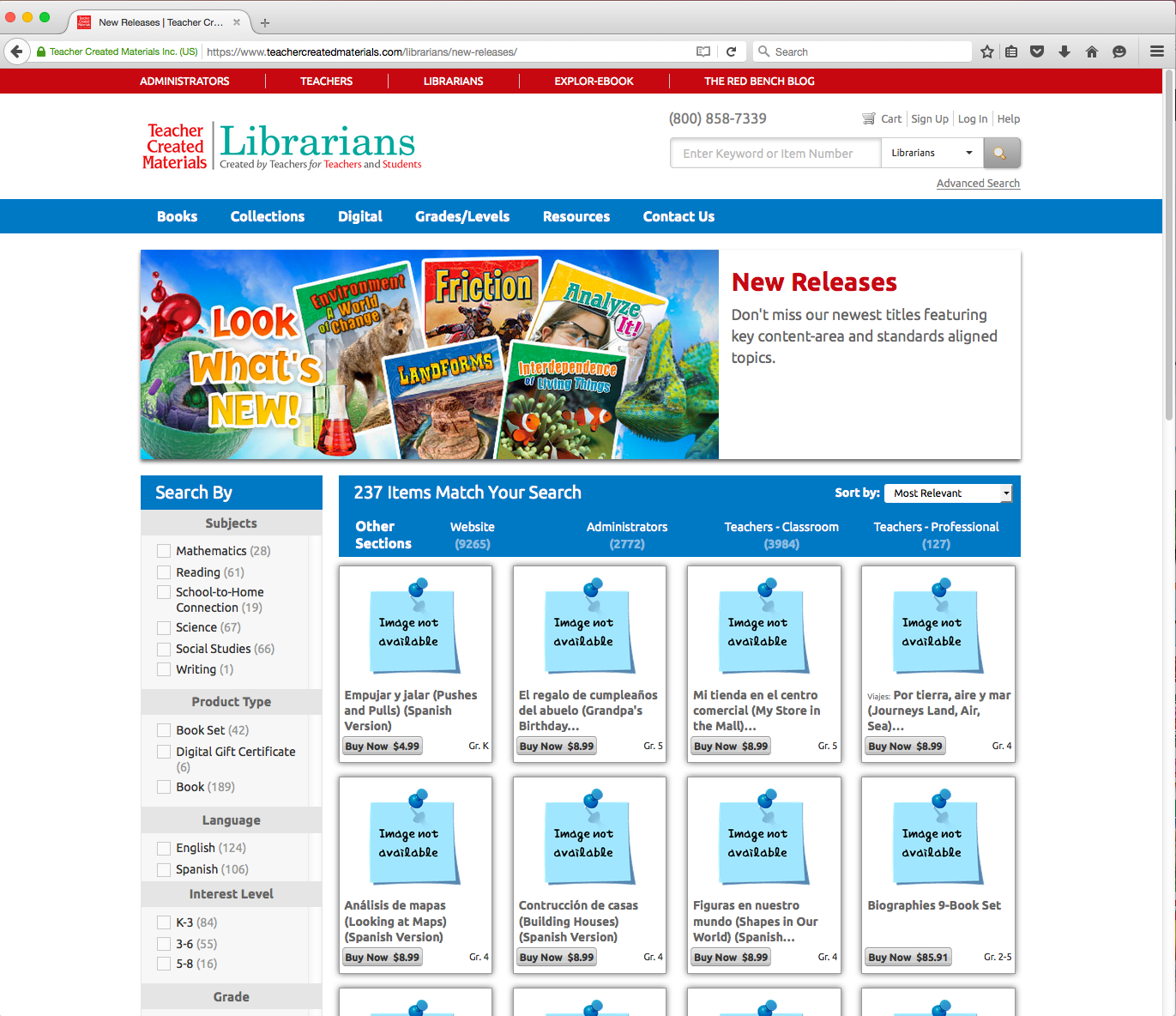
For New Releases pages, in particular, sometimes the product images would not be ready yet for a series, and fill the results screen with many squared images that said, " Image not available." While analyzing this, I noticed the language was not doing them any favors. If a product image would ever come, it was uncertain, reading as a shortcoming. We reworded it to have a more optimistic read with, "Image Coming Soon!" as I designed it to be more whimsical, pulling that paper texture from the other elements.

NEW List Feature
If there is an option to create a profile to make purchases on the site, why not add some features to make that more enticing? I conceptualized this "My List" feature after realizing that this could work as a sales reps tool, making specific orders for clients. Others could use this also, of course, for adding more grade 3 math books to their library, more grade 5 books about climate change, etc.
Email Design
I also designed emails for most B2B campaigns. Below is the TCML Library website Launch email. I used Emma to create this email, but I also have experience with Constant Contact/Mailchimp.
