

Primary Source Readers
Teacher Created Materials
Teacher Created Materials
I collaborated closely with a group of designers to design a relatively quick production of 20 individual Primary Source Reader books, under Teacher Created Materials. While sharing consistency across titles, assisting in various title's production rounds, these two titles below are a couple of examples of favorite ones I had complete ownership.
As a designer, I often collaborated with the editorial staff to find the most accurate and useful resources to cover all of our bases in what is considered a Primary Source, critical to history education. These text features include a Reader's Guide, sidebars, table of contents, glossary, and index to increase comprehension and academic vocabulary and a Your Turn! Activity encouraging students to use higher-order thinking skills. We consider the level of the reader when designing with primary sources. These books are leveled for Grade 5.
As a designer, I often collaborated with the editorial staff to find the most accurate and useful resources to cover all of our bases in what is considered a Primary Source, critical to history education. These text features include a Reader's Guide, sidebars, table of contents, glossary, and index to increase comprehension and academic vocabulary and a Your Turn! Activity encouraging students to use higher-order thinking skills. We consider the level of the reader when designing with primary sources. These books are leveled for Grade 5.
Harlem Renaissance
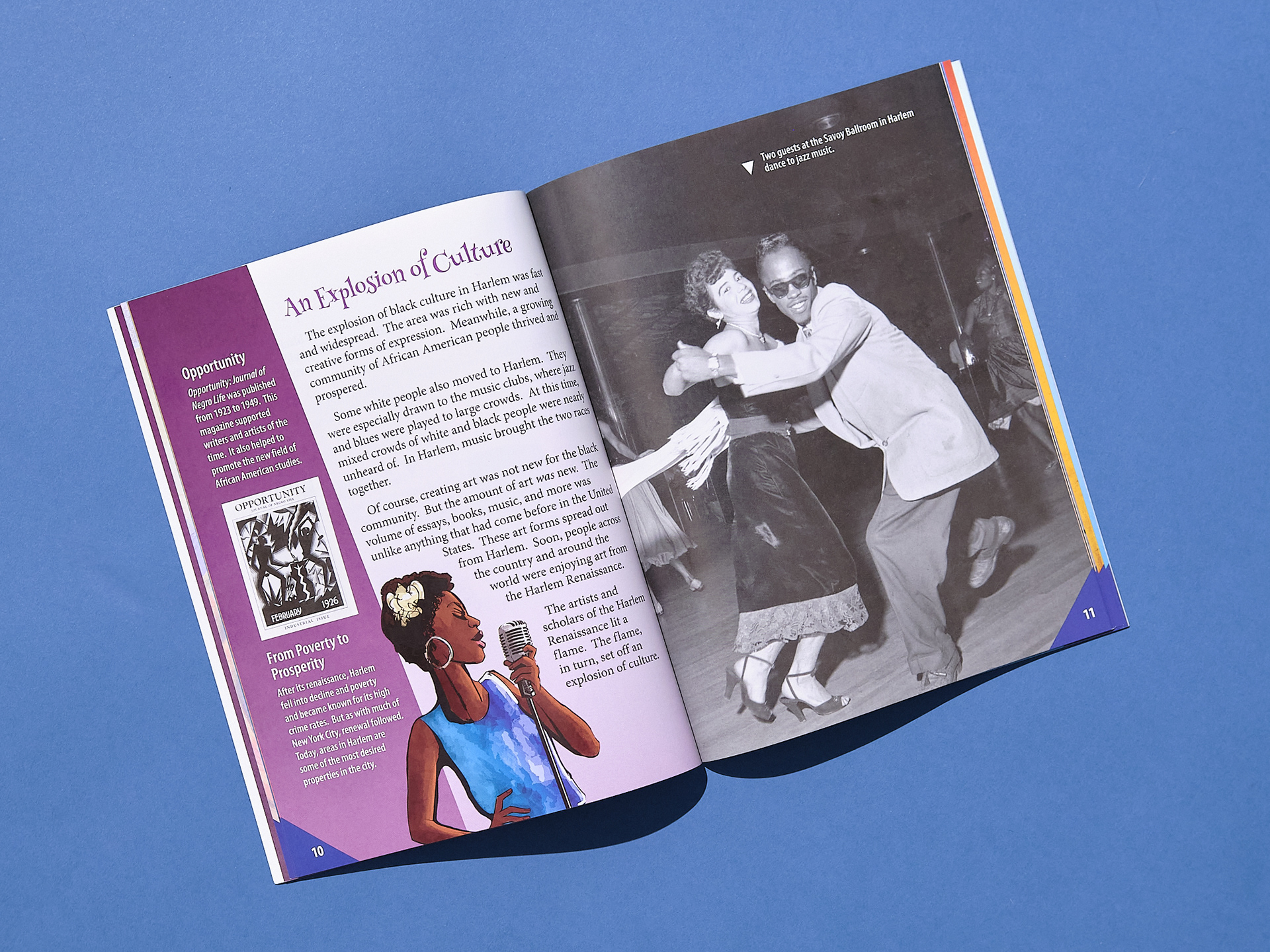
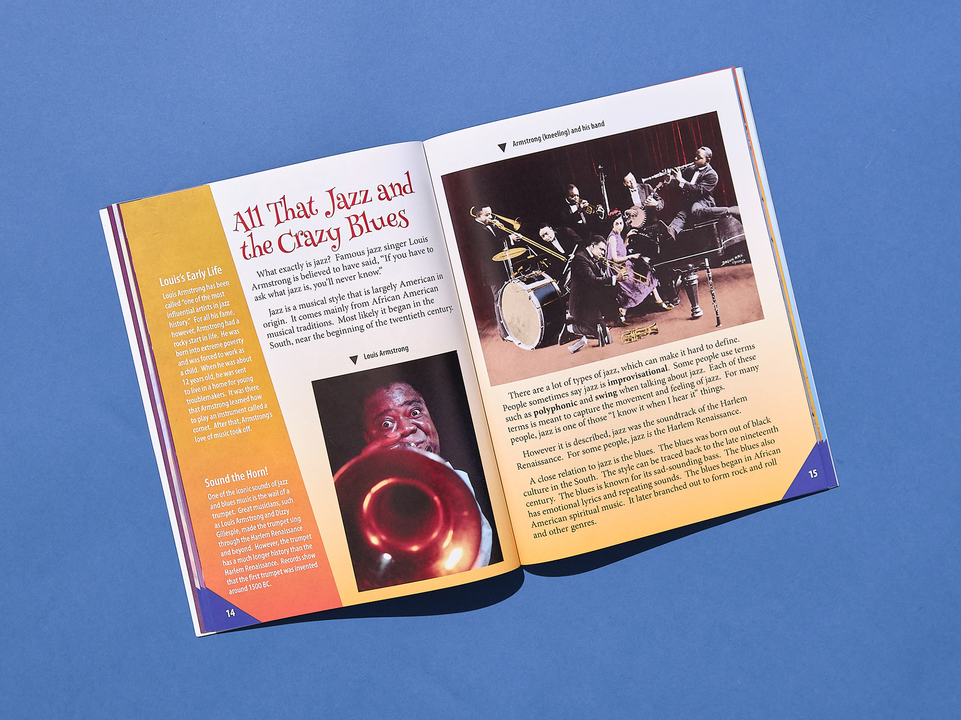
As one of the most inspiring periods in the arts, I was eager to pack this book with vibrant images to show kids how invigorating this time was for the black community. I was adamant throughout this series, image licenses permitting, that we find a way to display pictures in color whenever possible. Colorizing some of the images broke up the monotony of having a book filled with only hues of gray, while also bringing these visuals to life with a natural realism to hopefully connect the viewer to the past in a new way. I colorized both Billie Holiday and Louis Armstrong on the cover and a few images in some of the interiors of this series. I also happened to dig into finding some relatively uncommon photos shot on Kodachrome film (p7). In designing this book, I wanted the energy of the renaissance to jump off the pages.

World War I
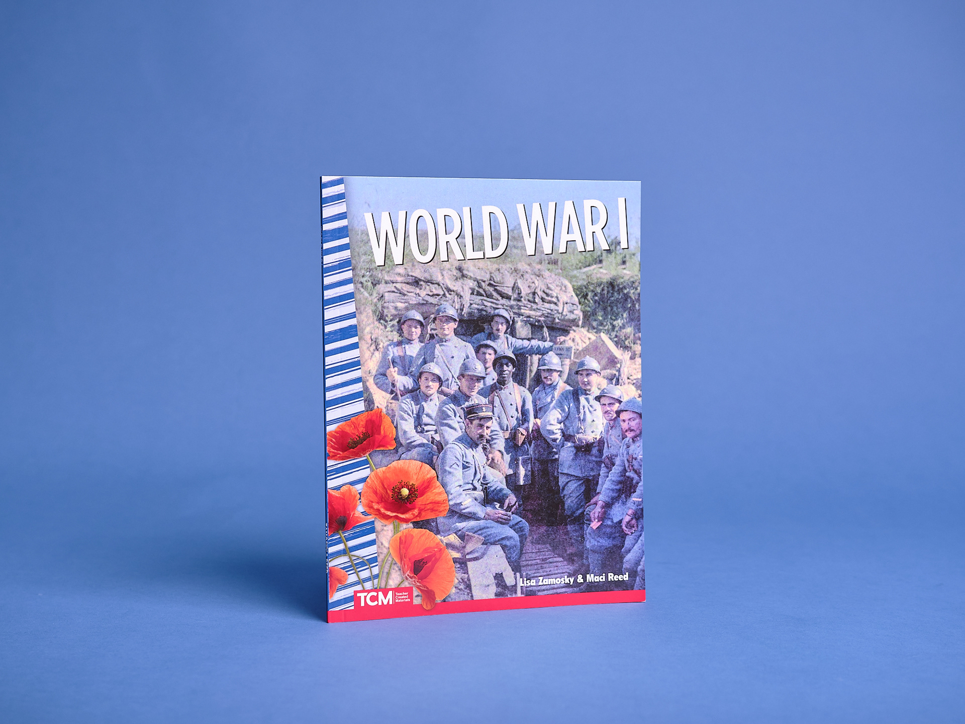
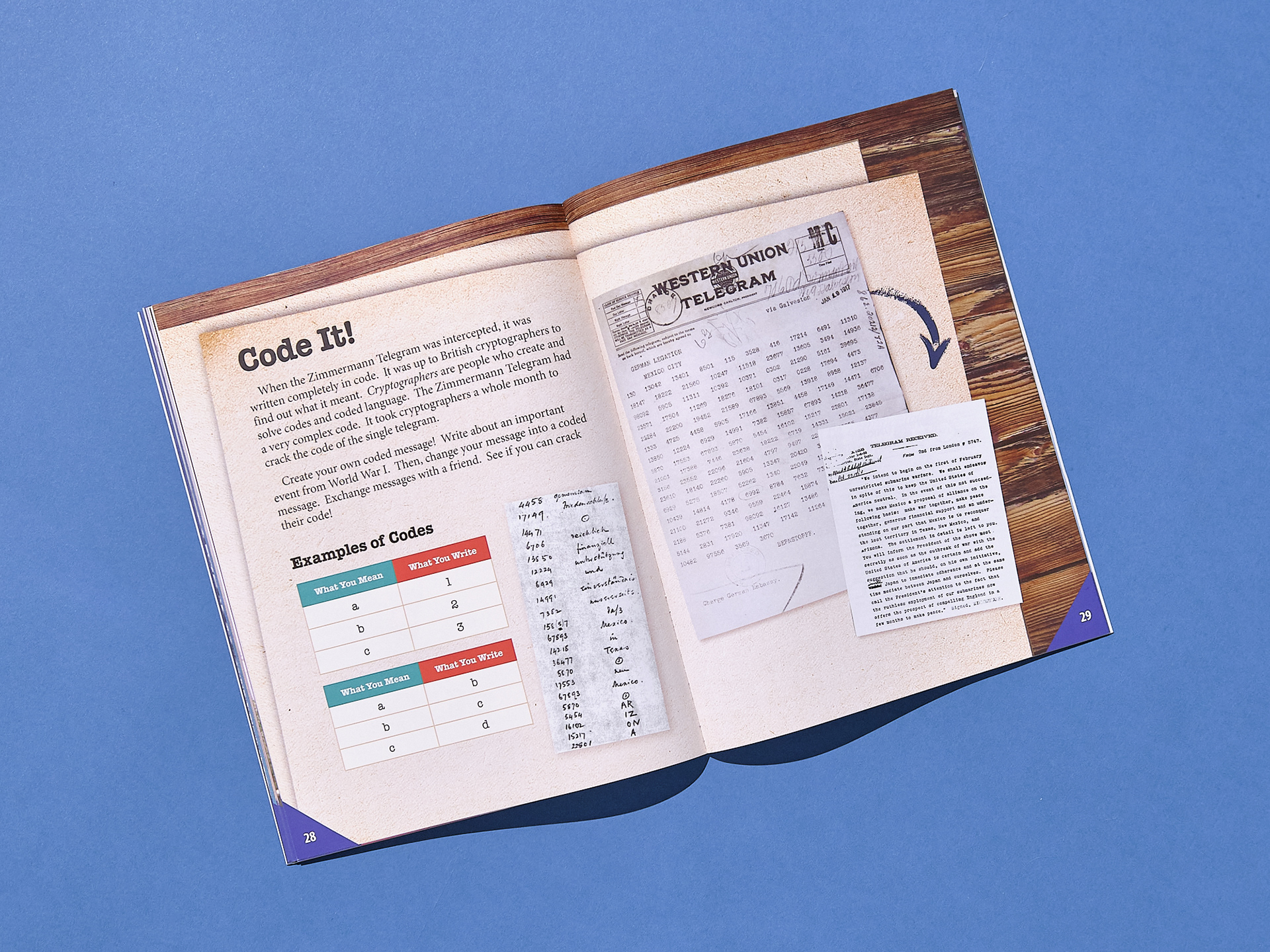
World War I was a fun challenge because it's a standard topic, done so many times. With all of my book designs, especially in education, I do initial competitive research to see what other publishers have already published. I evaluate what images are overused and look for unique ways to design a cover that feels informative, yet fresh. Like I mentioned above, I still found it necessary, although the resources are of older quality, to find ways to show WWI in color. Thankfully, we had enough room in our budget to include wonderful colorized photos I discovered while researching WWI photography. In the cover, I left a symbolic nod to the red poppies referenced in Remembrance Day symbolism, which started with a poem written by a World War I brigade surgeon who was struck by the sight of the red flowers growing on a ravaged battlefield. I then found a spectacularly unique colorized photo showing French soldiers in a trench in the first line from 1917 (Photo by Galerie Bilderwelt/Getty Images). Offering some of these events in color makes them feel so much more real to young readers; these soldiers become more familiar as actual living people.
Retouching
Occasionally, should a document or photo need retouching, I would often go in and clean up these to be more user friendly for the young kids looking at them. Heavy retouching, of course, was only done with images that were not rights managed. Many resources in the Library of Congress are available as Creative Commons, so I took plenty of joy in making store-front signs, documents, and photos more legible to help connect the younger readers to the book's text. See below for a before and after of just one of many retouching edits.

Original
